
Today I thought it was about time I shared something arty with you so here is my step-by-step guide to creating this land/waterscape of the Spey River in pastel on Clairefontaine Pastelmat.
Having never painted a landscape in pastel before I decided to see if I could complete this one within 2 hours. It is the subject of an art demo I'm teaching today which will last 3 hours so allowing time for explanations it should be achievable for my students. Fingers crossed :-S
My apologies for the quality of the photos which were taken on my phone. Some are clearer than others so I hope you get the gist.

I'm using Pastelmat in the colour Maize which is a light creamy yellow.
First I roughly sketch out the main areas that I'll be working on. I have divided the paper into 4 to help with the proportions and positioning. I'm using an HB pencil lightly to as not to score the surface of the paper. There is no point in putting any detail in the sketch as it will be obliterated shortly by the pastel.
I am using a limited pallet of 12 soft pastels. Light/Mid Blue, Dark Blue, Dark Green, Mid Green, Light Green, Black, Dark Brown, Terracotta Red, Warm yellow, Lemon Yellow, Cold Grey, and White
I am working with different ranges including Derwent, Daler-Rowney, Inscribe and probably some others varying in degrees of softness but they are all jumbled in together these days so I just go by feel of what I want.

Next I block in the sky with a mid to light blue and rub this in with my finger.

Then I block in the background with my light and mid greens.

Using the black I block in the dark areas of the background and foreground. After each blocking in I rub in with my finger to create a smooth surface.

Then I add some dark green to the foreground.

Followed by some light green to the trees in the background and the tops of the gorse in the foreground.

Next, using my dark blue, I shade the top of the sky and the darker areas of the water.

Then with my warm yellow I add in the gorse in the background along both tree lines and in the tops of the foreground.

The next step is to warm things up a bit with my terracotta red which I add sparingly to the tree line on the left, the trees on the far right and through the yellow of the gorse in the foreground. All the while I'm smudging these layers in lightly with my finger.

Using my white next I add in some fluffy clouds to the sky and highlights on the water and lighten up the lower part of the sky along the trees. I have used grey to create shading on the underside of the clouds. I have also added it to the light grassy areas on the left and where the rocks are on the right.

Adding a bit more substance now with dark brown in the shadow areas of the trees, using the broken pastel on it's side to create the form of the trees on the right and the gorse.

Starting to put more details into the trees in the background using short dotting strokes with my light green and some mid blue.

Ah, this is a better picture, you can see what I'm doing!
With black I have lightly contsructed a tree and added shading to the right and with the warm yellow I have added more detail and highlights to the trees. I have also used more blue in the grass area, along with the red, yellow and white. Can you tell what it is yet?

I use the same process on with the trees on the right, this time using the dark green for the tips of the trees, creating form with the dark brown, adding in light green for the highlights and using the edge of my grey to indicate the trunks of the tress.
I have added a touch of yellow to the trees and the gorse.

This is how the background looks now in comparison to the foreground.

Here I have grazed some dark blue and grey over the water and some black at the edges where the trees are creating shadow reflections and softened this in with my finger horizontally.

Adding a bit more white over the surface of the water.

Starting to dab some dark green through the gorse in the foreground.

Then warming it up again with dabs of terracotta, brown and some black. I'm using the pastels on their sides and working in the direction of the plant growth to create the shape of the bushes.

Now I start to go to town with my warm yellow building up all the beautiful gorse flowers. I just love their coconut smell :-) I have also added a bit more definition to the gorse in the background.

I have warmed up the gorse flowers with a touch of terracotta and added a little grey and white to the foreground where the stems and grasses are drier.

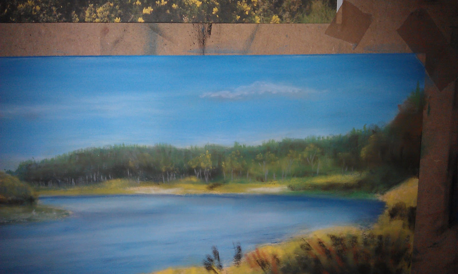
Using my light lemon yellow I tip the tops of the gorse to create the highlights. I have also defined the trees on the far right with some terracotta and light green and I've worked on the water a bit more.
I do tend to dot about to other areas when I see something I've missed, a bit more form here or shadow there, etc, so this is a rough guide. The trick is to step back and squint at your picture each time you change colour and see where else needs a dab.

The finished article!
I hope that this has been interesting/useful. Thanks for looking and please feel free to comment.

P.S. Here's the one I completed during my art demo this afternoon. Slightly different to the previous one so I must have picked up different colours in some cases and it's very difficult working at an angle so that everyone can see. It will need a bit more work to bring it up to the same level as the other one and make it a finished piece.
Everyone enjoyed the demo and it was very interesting to see all the different interpretations and the variations in colours which affected the mood of the picture. All in all a good day enjoyed by all :-)
No comments:
Post a Comment